Critique: Adobe.com
Ever since Adobe merged with Macromedia I've been critical about the design choices they've made with their website and marketing emails. I just happened to be on adobe.com today and was once again hit with a fresh round of that unfortunate feeling of unmet expectations.
Feeling down from the laziness of their craft, I decided to grab a screenshot of their site and get a little in-depth at what's bothering me about their site design. Their "Suite Life" sweepstakes happened to be the page that I landed on. There are issues with this page in particular, but most apply to the site as a whole.
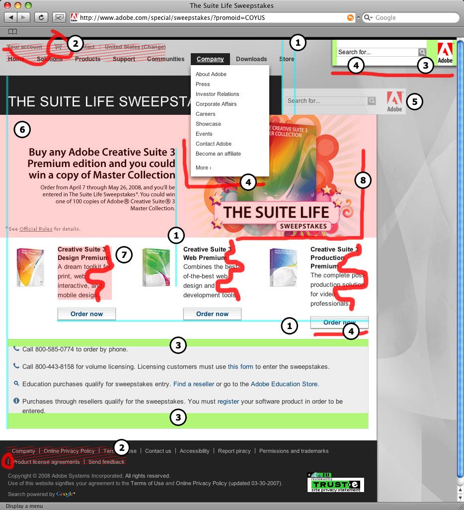
Here's a list of issues (in no particular order of severity) that give me that low-down sad design feeling whenever I'm browsing macromediaadobe.com. (For reference, list numbers correspond to the numbers in the screenshot.)
- No consistent regard for the grid system. The top navigation hangs off the edge of the black title box in a lonely way. The page title aligns nicely with the grey contact box toward the bottom of the page, but the CS3 Design Premium box hangs out too far to the right. The 'Order Now' buttons begin a stair-step routine. The headline and the CS3 Web Premium box are just off enough to look like placement wasn't thought through.
- Poor form and lack of hierarchy with navigation. Continuing with the top navigation, the two rows of floating menu items look noisy together. They compete with one another for attention. I also don't understand why the graphic of the cart is placed between textual menu items.
The bottom links arbitrarily wrap to a new line. The pipe "|" separator on the second line is hanging out for no reason.
It's also not apparent that 'All rights reserved' and 'Terms of Use' are links. The black box produced from the hover state is hardly noticeable. The same is true for the subtle change of text color. - Padding and whitespace is inconsistent. Generally, logos are given an equally generous amount of space on all sides. This keeps the logo from being cramped or associated with other elements. The Adobe logo is already crammed up there in the corner, but the space between the right page margin and between the logo and the search box is terribly different.
Same deal with the gray boxes at the bottom of the page containing contact information. There's much more empty space at the bottom of the box than at the top.
- Loud dropshadows for no real reason. I can deal with dropshadows on buttons as they tend to actually help visually describe what we perceive a button to be. Adobe is also putting dropshadows on their logo/search element and the dropdown navigation. I really need a good reason for dropshadow use and I'm just not finding it in these two elements. Especially the logo/search element. (Because it moves it gets one?) You can also see a definitive line where the dropshadow grad fails to taper off properly.
- The logo/search element is so weird in so many ways. This element goes against the rest of the layout (read left to right) and floats around in the upper right corner of the page forcing the viewer to break flow and read this portion in the opposite direction, from right to left. This is especially noticeable if you resize your browser window. (Why is this the only element that changes position when resizing the window?)
Viewers expect to see logos in the top left area of the page. The Adobe logo is stuck on the opposite side almost like the company doesn't want to associate the rest of the layout with the logo.
This element goes against the stacked nature of the box elements that make up the majority of the page. Most of the layout sits while this element hangs. It looks like it could almost fit in the space adjacent to the black title box and above the main content box, but it just doesn't fit.
This is the most out of place and visually annoying element on the page.
- No attention is being paid to SEO. The entire meat(description) of the page is locked up in an image. In other words, search engines can't read any details about the sweepstakes because all the text is in image form. The alt tag only repeats the page title.
- Typographical skill is lacking. The leading feels off in the product descriptions. Line breaks are all wrong.
- Nothing is dynamic. The whole layout is very boxy and rigid. What if the main 'Suite Life' image were a background element and was allowed to flow behind the products and their descriptions? What if the rays could extend behind these elements as well?
The point of all this. When you buy a tool or a product you expect the company that sells it to know how to use it. Adobe sells design tools. I feel weary buying design tools from a company that has an OK looking website.