Adobe.com Needs Help
Adobe.com's site design has taken a bit of a dive since the merger with Macromedia. The former elegance of subtle grays with highlights of red and the ever important use of white space has been replaced with a cramped mess of stark boxes and boring menus.
Before: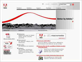
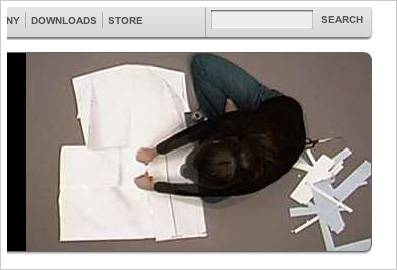
The worst part is the banner showcasing Adobe products. The image quality in these presentations is absolutely terrible. Adobe creates the best image manipulation products in the world, yet they can't display photos on their banner without compressing them down into a pile of dookie. And uninspiring photos at that. Adobe has to realize that Photographers and Graphic Designers and other artists of all types are the majority of people who look at the site. These are people who can tell when an image isn't looking its best.
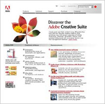
Now:
Lots of compression.

Lack of image information. No sharp edges.
Uninspiring.
I think it's time to bring back the old guard. Maybe even get Hillman Curtis back in there. Give Adobe.com its glory back!